Introduction: From Empty Walls to Meaningful Spaces
You’ve probably felt it: a room with the right furniture, the right paint color, even good lighting — and it still feels unfinished. The space reads as generic, more showroom than home, and it’s hard to say exactly why.
Nine times out of ten, the missing piece is on the wall. An empty wall is functional, but it says nothing. The moment the right artwork goes up, the room gets a personality — some emotion, some color, some sense of who actually lives there.
This is the real power of art in interior design: it doesn’t just fill space, it gives a room identity. Whether you’re decorating a first apartment, redesigning an office, or simply staring at a blank wall wondering what belongs there, understanding how art, composition, light, and emotion work together will change how you think about every room you walk into.
1. Why Art Matters in Interior Design
Art is often treated as the last step in decorating — something to worry about after the furniture arrives. But art isn’t decoration in the way a throw pillow is decoration. It actively shapes mood, atmosphere, and how a space makes people feel the moment they walk in.
A restaurant with warm, expressive artwork on the walls feels different from one with bare walls, even if the menu and lighting are identical. A waiting room with a single striking piece feels less clinical than one with nothing at all. An office with thoughtful art signals a different kind of workplace than one with none — it suggests attention and care.
First impressions form fast, often before someone consciously registers the furniture or layout. Art is frequently what people notice first, because it’s the one element in a room that isn’t purely functional. That’s exactly why it carries so much emotional weight.
2. How Art Can Transform a Blank Wall
There’s a real difference between an empty wall waiting for the right piece and a wall nobody has thought about at all. The first is potential. The second is just unfinished.
The options are wider than most people assume. A detailed pencil drawing can bring quiet, intimate focus to a reading nook. A bold painting can anchor an entryway. Black-and-white photography adds a documentary, personal feel to a hallway. Limited-edition prints offer color and scale without the cost of an original. Sculptural or mixed-media pieces work well where a flat piece would get lost, like above a mantel with real depth.
The goal isn’t to fill space for the sake of it. A wall covered in mismatched pieces can feel more unfinished than one bare wall with nothing on it yet. The aim is visual balance and meaning — one intentional choice beats five accidental ones.
3. The Role of Color, Texture and Light
Artwork doesn’t exist in isolation — it reacts constantly with everything around it. The same painting can look completely different depending on where it hangs.
Wall color changes how art reads: a muted, tonal drawing recedes into a similarly neutral wall but commands attention against a bold or dark one. Furniture matters too — a detailed piece can get visually lost near heavily patterned upholstery, while it stands out clearly against simple, solid furnishings.
Light changes art more than almost anything else. Natural light shifts through the day, so a piece near a window can look soft in the morning and sharper by evening. Artificial lighting matters just as much — a warm spotlight angled correctly can bring out the texture in a graphite drawing or an oil painting that flat overhead light would flatten completely.
Texture and material add one more layer. A heavily textured piece against a smooth wall creates contrast, while a texture that echoes the surrounding materials creates cohesion instead.
4. Composition: The Connection Between Drawing and Interior Design
This is where art and interior design overlap more than people expect. Artists spend years learning composition — balance, proportion, scale, perspective, contrast, focal points, negative space, rhythm — and every one of those principles applies directly to arranging a room.
Balance in a drawing means the visual weight on one side doesn’t overwhelm the other. Balance in a room works the same way: a large artwork on one wall needs something, even something subtle, to keep the space from feeling lopsided. Scale and proportion decide whether a piece reads as a highlight or gets swallowed by the space around it — a small drawing on a huge wall can look like an afterthought, while an oversized piece in a tight hallway can feel overwhelming.
Focal points matter in both disciplines too. A well-composed drawing directs the eye to one place first; a well-designed room does the same, usually with art as the anchor. Even negative space carries over — the empty wall around a single striking piece isn’t wasted space, it’s what gives that piece room to be seen.
Understanding composition, even loosely, changes how you choose and place art entirely.
5. Choosing the Right Artwork for a Space
Selecting art isn’t just about personal taste — it’s about fit. Room size, wall size, the existing color palette, furniture, lighting, the room’s style, its purpose, and your own taste all play a role in what actually works.
Living Rooms
The most-used, most-seen room usually benefits from one bold, central piece above the sofa or fireplace — something substantial enough to anchor the space.
Bedrooms
Calmer, more intimate artwork tends to work better here. Soft tones, quiet subjects, and smaller-scale pieces near the bed suit a room meant for rest.
Offices
Art here can do double duty — a striking piece signals professionalism to visitors, while something personally meaningful keeps the space motivating during long hours.
Hallways
Long, narrow walls suit a considered sequence of smaller works rather than one large piece, turning a transitional space into something worth walking through slowly.
Dining Spaces
Art near a dining table gets looked at repeatedly and up close, so detailed, textured pieces often work better than anything too busy or bold.
Creative Studios
These spaces can take more experimentation — bold color, mixed media, or work-in-progress pieces that reflect a creative process rather than a finished, polished look.
6. Art as a Form of Storytelling
The most memorable interiors rarely come from matching a room to a trend. They come from artwork that means something. A drawing that reminds someone of a person, a place, or a feeling does more for a room than a technically perfect piece chosen only because it matched the sofa.
This is the real difference between a decorated room and a personal one. Generic prints can make a space look finished, but meaningful artwork makes it feel lived-in and specific to the people who chose it. A single piece with real personal or cultural weight can carry more emotional presence than an entire wall of safe, forgettable choices.
7. Artist Spotlight: Sadashiv Sawant
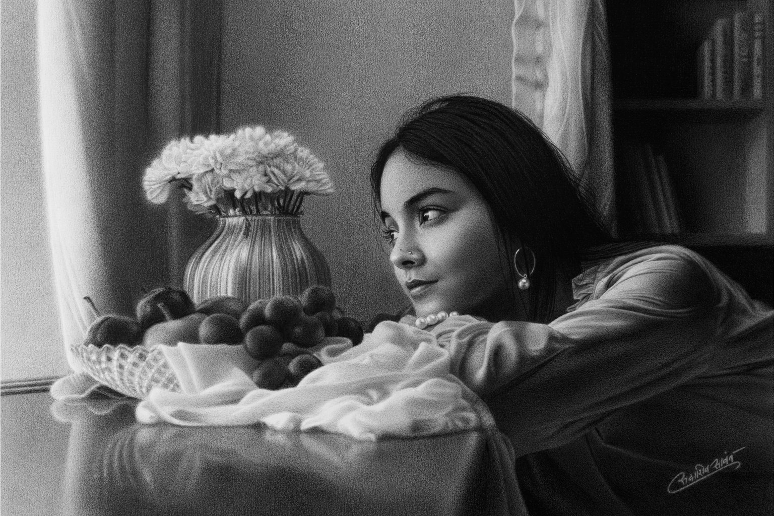
The idea of art as a focal point is easy to see in the work of individual artists. Sadashiv Sawant, a Mumbai-based graphite artist, works in a single grade of pencil, building each piece through slow, layered observation of proportion, light, and shadow rather than relying on color or scale to draw attention.
His portfolio centers on single-figure portrait studies — the kind of detailed, realistic drawing that rewards a closer look rather than a passing glance. That quality is exactly what makes strong drawing-based art effective in interiors: it doesn’t shout for attention across a room, it earns it, drawing a viewer closer to notice the shading, the composition, the expression.
A piece like this works less like wall decoration and more like a quiet anchor for a room — something that gives people a reason to stop, look twice, and feel something specific rather than simply register that a wall isn’t empty.
8. Art for Different Interior Styles
Different interior styles call for different kinds of art, though the underlying principles stay the same.
Minimalist
A single, well-placed piece with clean lines or subtle detail works better than several smaller ones — minimalism rewards restraint.
Modern
Bold color, abstract form, or strong contrast complements clean architectural lines without competing with them.
Contemporary
This style allows more variety — a mix of mediums and subjects, as long as there’s a common thread in color or tone.
Traditional
Classic techniques suit traditional interiors well: detailed drawings, oil paintings, or portraiture in the spirit of older craft traditions.
Industrial
Raw materials and exposed textures pair naturally with high-contrast black-and-white work or anything with visible texture and process.
Luxury
Fewer, more considered pieces read as luxury better than many smaller ones — quality and scarcity over quantity.
Creative or Workspace Interiors
These spaces welcome the most personality: unconventional media, in-progress pieces, or work that shows process as much as a finished result.
9. Common Mistakes When Using Art in Interiors
A few mistakes come up again and again, and all of them are easy to avoid once you know what to look for.
Matching color over meaning. Choosing art purely because it matches the sofa often ages badly. Pick pieces you’ll still want to look at after the color trend passes.
Going too small. A modest piece on a large wall tends to look accidental rather than intentional. When unsure, size up.
Overcrowding. More art doesn’t mean more impact — a wall crammed with pieces competes with itself. Give key pieces room to breathe.
Ignoring lighting. Even great art looks flat under the wrong light. Plan lighting alongside placement, not after.
Ignoring scale and proportion. Art should relate to the furniture and wall around it, not just fit into a leftover gap.
Chasing trends. Trend-driven choices rarely age well. Personal meaning does.
Treating art as an afterthought. The earlier art enters the planning process, the better it works with everything else in the room.
10. How to Create a Meaningful Art-Focused Space
Bringing all of this together doesn’t require an interior designer — just a clear process.
- Understand the room — its size, light, and how it’s actually used.
- Identify the focal point — the wall or area that naturally draws the eye first.
- Decide the mood you want: calm, bold, warm, minimal.
- Choose artwork that fits that mood, not just the wall color.
- Consider size and proportion relative to the wall and furniture around it.
- Plan lighting specifically for the piece, not just the room in general.
- Create visual balance by giving the surrounding space room to support the piece rather than compete with it.
- Add personal meaning — the detail that turns a good-looking room into one that feels like yours.
Follow these in order, and even a single well-chosen piece can do more for a room than an entire afternoon of furniture shopping.
Conclusion
A house, office, or public space can be structurally sound and still feel like nothing in particular. Furniture and architecture create the shell; art gives it identity and story.
The power of art in interior design isn’t about following trends or filling empty walls for the sake of it. It’s about understanding how color, light, texture, and composition work together, and choosing pieces that mean something rather than pieces that simply fit. A well-placed piece can turn a room people merely pass through into one they actually remember.
The next time you’re facing a blank wall, don’t think of it as empty space to fill. Think of it as the one place in the room still waiting to say something about who lives there.